See the Patterns in Data – Without Being a Statistician


See the Patterns in Data – Without Being a Statistician
Data is everywhere – in our work, our daily routines, and the digital traces we leave behind. Yet for many people, data analysis sounds like something reserved for statisticians and data scientists. The truth is, you don’t need a degree in statistics to spot patterns in data. With a few simple tools and a curious mindset, you can start to understand what the numbers are telling you – and use that insight to make better decisions.
Start with a question – not the numbers
The first step in working with data isn’t opening a spreadsheet; it’s asking the right question. What do you actually want to know? Perhaps you’d like to understand why some social media posts get more engagement than others, or which products sell best in certain seasons.
Once you have a clear question, it becomes easier to decide which data to look at – and which to ignore. It’s not about analysing everything, but about focusing on what’s relevant to your goal.
Use visual tools to see the patterns
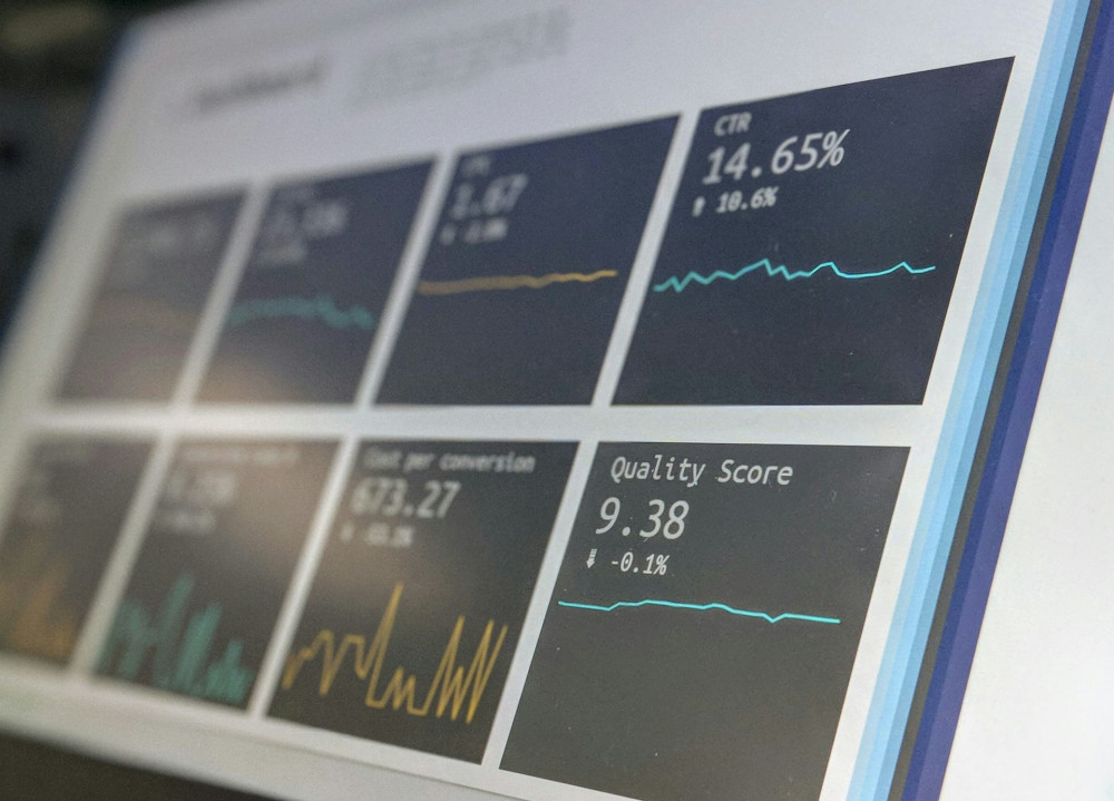
Humans are visual creatures. Graphs, charts, and dashboards can reveal relationships that raw numbers can’t. You don’t need expensive software – tools like Excel, Google Sheets, or free online platforms such as Datawrapper and Flourish can take you a long way.
- Bar charts show differences between categories, such as sales by product.
- Line charts make it easy to see changes over time.
- Pie charts can illustrate proportions, though they can be tricky to read if there are many categories.
- Heatmaps highlight areas of high activity, such as website clicks or customer locations.
When you visualise your data, patterns become clearer – and you can quickly see where to dig deeper.
Look for trends – not one-offs
A single data point rarely tells the full story. It’s the trend over time that reveals what’s really happening. Maybe your website traffic spikes every Monday, or perhaps sales dip every August. Recognising these patterns helps you plan and prioritise.
But be careful not to jump to conclusions. Some fluctuations might be caused by one-off events – a bank holiday, a marketing campaign, or even the weather. Always ask yourself: Is this a real pattern, or just a coincidence?
Combine data with your own knowledge
Data shows what is happening – but not always why. That’s where your own experience and context come in. If your newsletter’s open rate suddenly drops, your understanding of your audience can help explain it: Was the subject line less engaging? Did it go out at a bad time?
When you combine data with insight, you get a more complete picture – and can make smarter, more informed decisions.
Learn through small experiments
You don’t need massive datasets to learn something useful. In fact, small experiments are often the best way to uncover patterns. Try posting on social media at different times, or test two versions of a webpage. Compare the results and see what works best.
The goal isn’t to find the perfect answer straight away, but to learn continuously. Data becomes valuable when it’s used as a foundation for action.
Make data part of everyday life
Working with data doesn’t have to be a special task you only tackle occasionally. The more often you look at your numbers, the better you’ll understand what’s normal – and when something stands out.
Set up a simple routine: once a week, review a few key figures such as website visits, conversions, or customer feedback. Over time, you’ll start to notice patterns you might have missed before.
Læs også:



Data is about people
In the end, data isn’t really about numbers – it’s about people: their behaviour, preferences, and needs. When you learn to see the patterns, you can use them to create better experiences, more relevant messages, and smarter decisions.
You don’t need to be a statistician to get started. You just need curiosity, good questions, and a willingness to experiment. The rest you’ll learn along the way.
Læs også: